
canCalls-to-action are a vital part of your pages. Yet, they’re often forgotten about or they’re merely an afterthought to a comprehensive design strategy.
While they are small and may seem insignificant, they are the element that directly results in conversion. If you don’t take the time to write for them and design them well, you will inadvertently be killing your conversion rates.
Here are seven common CTA mistakes that may be a part of your website and what you should be doing instead:
1. Using Bland, Non-Branded CTAs
While CTAs don’t provide that much room for creativity and play with words, they should still be used to showcase your personality, your brand voice, and what you stand for.
When you use bland, run-of-the-mill, ordinary CTAs, you are missing out on the opportunity to stand out in the minds of your target audience. You are becoming just another website they’ve seen that they, one they are less likely to remember and return to.
Branding and personalizing your CTAs can be quite simple. Take a look at Dress Forms USA, whose main CTA is to “shop professional dress forms.” This is a simple way to add a bit more personality to it and refocus the customer’s attention on the product they are about to buy.
You can also use your brand name in CTAs to achieve the same effect; you don’t necessarily have to mention the product. Anything other than “buy now” or “click here” will do well.
2. Focusing Too Much on One Conversion Path
Brands often inadvertently try to funnel all of their audience down one conversion path. They may put their top products front and center, or they may personalize their landing pages to a certain segment of their audience.
While this is a popular approach, it may mean you are losing out on conversions from customers who are interested in something else.
If you can provide more than one conversion path and cater to different kinds of customers, you’re more likely to close more deals, too.
A good example to check out is Golf Cart Tire Supply. They have a very straightforward segment at the top of their homepage that provides four different CTAs, targeting four kinds of customers. It immediately tells you what kinds of products they sell. And are much more likely to pique your interest this way than if they’d pushed the tires at you.

The best way to use this tactic is to analyze your audience and see what the most common conversion paths are. Then, create CTAs for each and place them near each other without seeming to favor one over the other.
3. Forgetting to Highlight Prominent Benefits
While the most straightforward purpose of the CTA is to facilitate conversions, it can be used for other things, too. For example, your CTAs can help you put the benefits of a product or service to the forefront.
Let’s look at an example to illustrate this point. GetSafe has a great CTA that says “try risk-free for 30 days.” Pointing out that the brand does offer a 30-day trial without any risks is an excellent way to boost conversions.

Notice how this CTA only appears in the main menu, which is sticky and is not used anywhere else on the page. All the other CTAs focus on other conversion paths. This one, however, is very prominent, easy to spot, and will certainly capture a visitor’s attention.
You can achieve the same effect by stating that customers can get a free trial without leaving the payment details, that you offer free shipping over a certain threshold, etc.
4. Using the Same CTA All over the Page
Brands often come up with one good CTA and then proceed to use it on every page all of the time. However, no matter how good a CTA is, you need to provide a bit of diversity for your visitors.
This will allow them to check out different aspects of your offer, and they won’t get bored with you constantly trying to push the same action.
You can create CTAs for getting in touch with you, for learning more about the brand, or for making a purchase. You can, of course, create various CTAs for different kinds of products.
However, make sure that CTAs that result in the same action are kept the same. Don’t use a different button for getting in touch, for example, as it will only lead to confusion.
Somnifix did a good job with their various CTAs. They are all designed around the same simple principle, but the wording changes. They are also cleverly placed on the page.
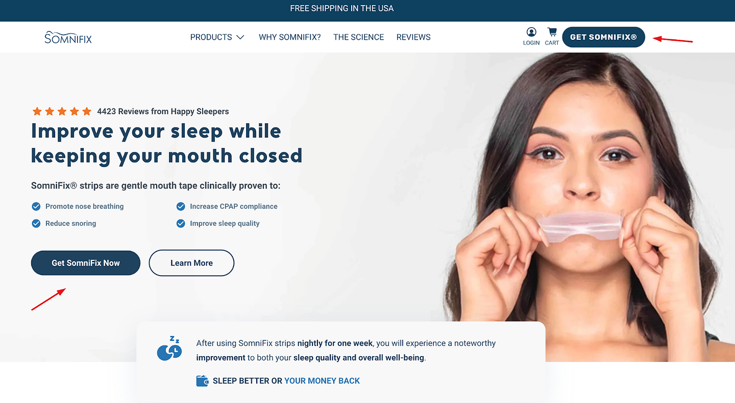
Conversion-oriented CTAs follow product descriptions, while informative CTAs follow informative passages.
5. Making the CTA Too Prominent
Speaking of CTA prominence, you don’t want to make the mistake of making the CTA pop too much. Yes, you want it to be one of the most noticeable elements of a page, but you don’t want it garish or obnoxious.
It is true that vibrant colors are a good choice for CTAs. However, they still need to blend in with the rest of your page design. The louder the CTA, the lower the chances it will get clicked on, as visitors will feel you are pushing your agenda too strongly.
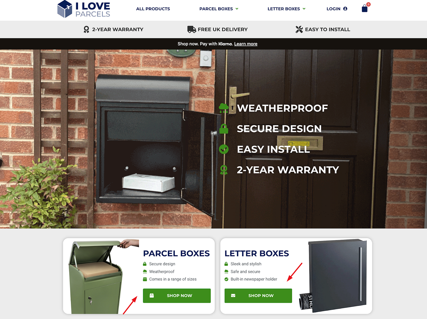
I Love Parcels is a nice example of a brand that has managed to blend seamless design with prominent CTAs. Granted, their page is far from perfect and it’s a bit cluttered, but they do get the CTAs right. They are blue or green and match the rest of the page, and they are also personalized enough and provide plenty of various results.
6. Insisting on a Direct Conversion
Finally, while CTAs are made for converting, you don’t always need to use them to push a conversion or a sale. Sometimes, your visitors will need more time. They will appreciate the opportunity to explore and learn more about your brand and offer without pressure.
This doesn’t mean that you should completely omit a sales-oriented CTA. You should, however, try to incorporate other types of CTAs high on your landing pages that will offer longer conversion paths.
WP Engine is a good example of this tactic. The first CTAs you come across on their homepage don’t let you buy anything. In fact, none of the CTAs on their main carousel are conversion-oriented. All of them lead to informative pages. Or case studies and webinars. They want you to understand all their product can do, before they ask you to commit to it.

7. Forgetting the Value of A/B Testing
Our final point does not deal with a CTA mistake per se. It has to do with the fatal error of forgetting the importance of A/B testing your CTAs on a regular basis.
Even if you’re currently seeing a satisfactory conversion rate, you should still test them out. You don’t want to become complacent and rest on your laurels too much. Switching things up every once in a while will keep your brand fresh and interesting.
Plus, you may discover a new CTA formula that works even better than the one you used to be so proud of.
Wrapping Up
Take a look at your CTAs and see if you may have made one of these conversion-killing mistakes. Even if your CTAs don’t tick any of the above boxes, don’t forget how important it is to regularly A/B test them and see what you can do to improve user experience and conversion rate.